


IRA Higdon Grocers | Cairo, GA
This medium-sized commercial grocer is a long-established family business serving many of the Independent Grocers Association (IGA) chain of stores throughout the southeast.
IRA Higdon is a solid, well-respected company with family roots that go back to 1909. The company recently installed new management made up of younger family members of the Higdon clan. They wanted to bring a fresh, new image to the public, while retaining the Higdon tradition of personalized service in the industry.
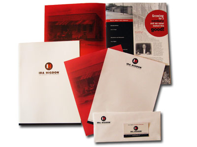
We began a new branding process with a contemporary red, black and white logo, emphasizing the IH in a 3-color display.
A sales brochure, designed using original period photography to highlight tradition, allowed the sales agents to have a practical price-list holder doubling as an attractive, engaging collateral piece.
Next, trade press advertising and a new trade show booth, mixed with a heavy dose of public relations, helped to establish the new management team and its perspective for a future of continued, outstanding service to clients.
Concurrent with media activity, the IRA Higdon trucks were emblazoned with the new logo and painted with a bold red and white theme to distinguish them from all the others on the road. The IRA Higdon "mobile billboards" soon appeared all over the southeast.
The campaign was a success, and we continue to fine-tune the brand with regular updates.